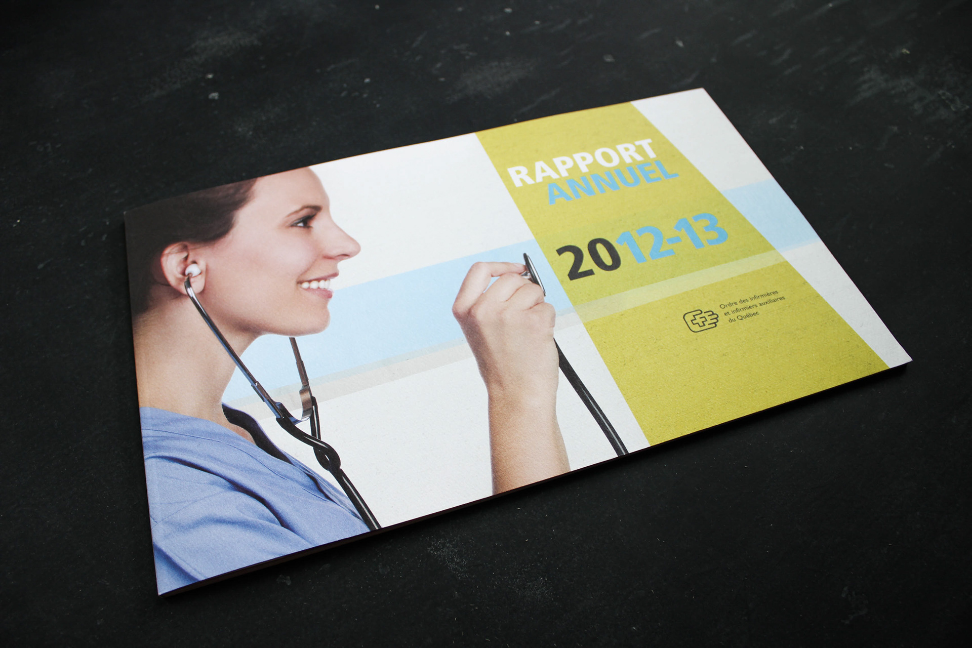


La ligne graphique du rapport annuel de l'OIIAQ 2012-2013 s'inspire de la mission de l'organisation, qui se trouve à la croisée entre la protection du public et la promotion du développement professionnel de ses membres. Ainsi, des bandes texturées aux couleurs vivantes se rencontrent en appuyant la trame graphique tout au long du document. Le format horizontal du rapport lui confère ergonomie et harmonie visuelle. La grille sur quatre colonnes permet d'aérer le texte et la police de caractère choisie, Frutiger, offre une lecture fluide. Les tons dominants de cyan et jaune éclatants jouent le rôle d'accents chromatiques en s'appliquant aux textes qui demandent une visibilité accrue.
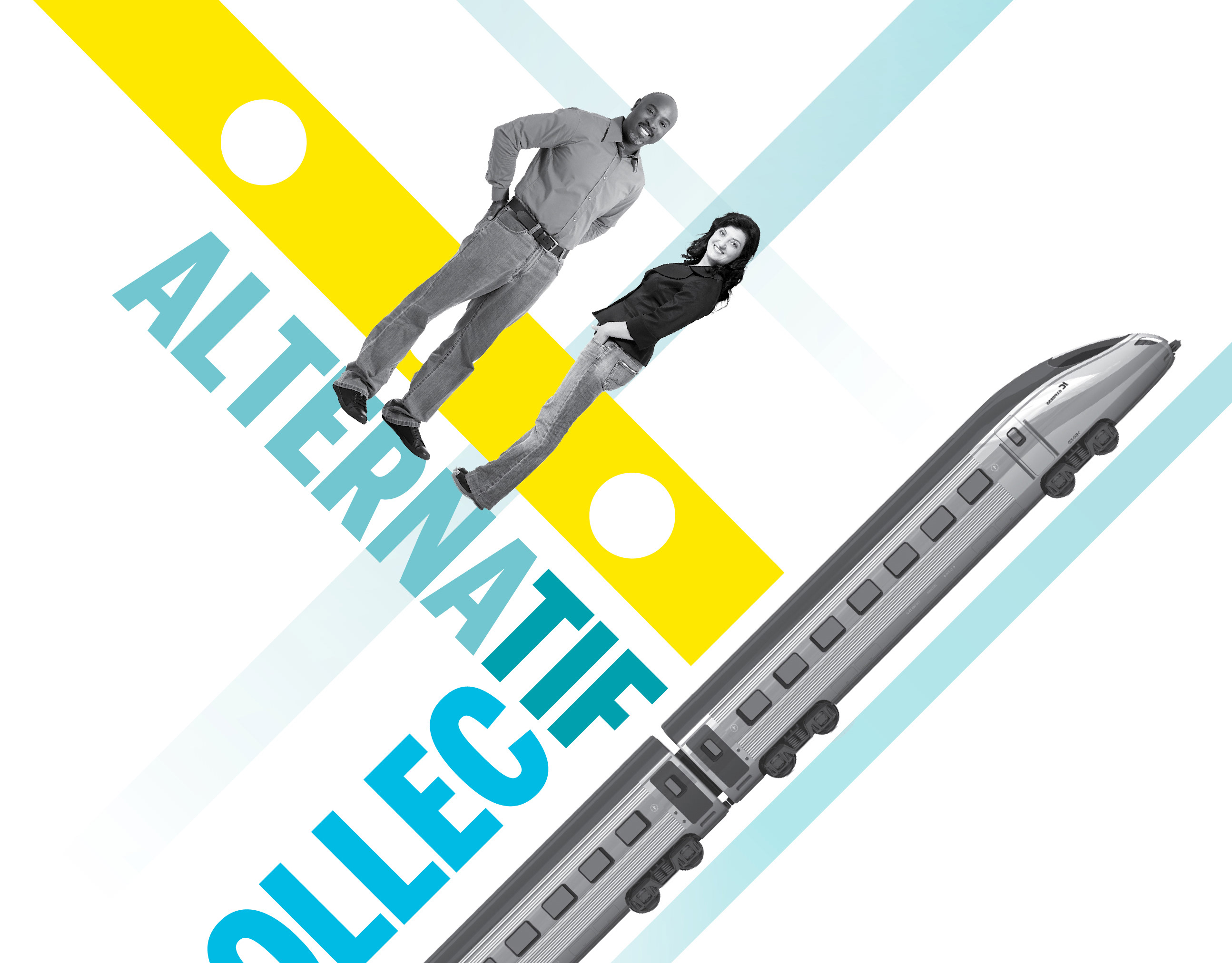
The branding of the 2012-2013 OIIAQ Annual Report is in line with the organization's mission, which is at the crossroad between public protection and the professional development of its members. Therefore, bright textured stripes meet throughout the document, supporting the graphic thread. The horizontal format enhances ergonomics and visual harmony. A four-column grid lightens the text blocs and the chosen font - Frutiger - allows for easy reading. Cyan and yellow dominate the color theme and are used to highlight important information.
The branding of the 2012-2013 OIIAQ Annual Report is in line with the organization's mission, which is at the crossroad between public protection and the professional development of its members. Therefore, bright textured stripes meet throughout the document, supporting the graphic thread. The horizontal format enhances ergonomics and visual harmony. A four-column grid lightens the text blocs and the chosen font - Frutiger - allows for easy reading. Cyan and yellow dominate the color theme and are used to highlight important information.